A Picture is Worth a Thousand Projects
One of the first things I did when I started thinking about restoring my dining room to period condtion was to purchase a copy of Bungalow Basics: Dining Rooms by Paul Duchscherer and Douglas Keister. (Okay, okay…so I bought copies of all the Bungalow Basics books, plus quite a few other bungalow and arts and crafts design books.) Some readers don’t like the small size of the Bungalow Basics books , but I find it convenient. They don’t take up too much space on the bookshelf or in my briefcase. You can take them with you to the paint or fabric store with ease. And most importantly, you can hold the book in one hand while you sip wine from a glass held in your other hand!
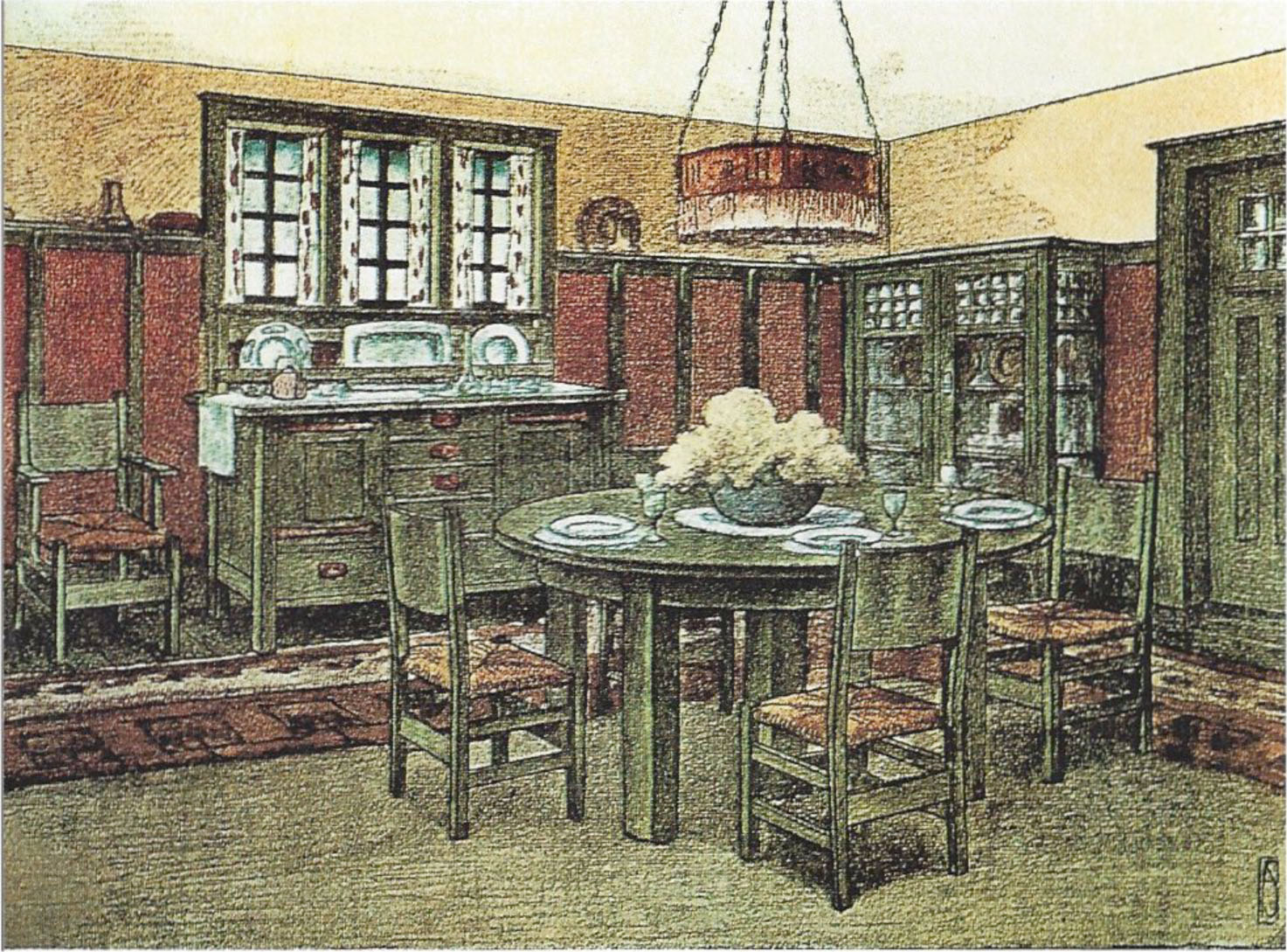
I didn’t have to look far into the book to find my starting place. Just a few pages in, there it was–this picture caught my eye.
Sometimes a single picture is all you need to get started–especially if it is a composite image, like this one, which shows what is typical in a bungalow Arts-and-Crafts style dining room. (Actually, that’s precisely the kind of picture to look for.) Not that you will follow it slavishly. But a single picture that is typical of the style you are wanting to invoke can give you an anchor, a grounding, a sense of the typical features of that period. You might end up making so many changes along the way that what you end up with bears only the faintest resemblance to the picture. But that picture is your reference point.
What caught my attention first was the color scheme. I had done some preliminary investigative color work and found that I very much liked a period “Birdseye Maple” color which I had already painted the walls. (Mostly I had wanted to get rid of the Art Deco Blue color and I thought I’d try this color on for size.) So, when I saw this picture, the color above the wainscoting caught my eye. I hadn’t thought of painting the room with two colors, but I liked the way this room was designed.
A dining room is a room almost solely devoted to sitting. So, having a two-tone colored wall with the shoulder-height level wainscoting that is traditional to the Arts-and-Crafts style makes sense. It creates a sense of intimacy for the seated dinner guests. And this warm, brownish red color compliments the wood-toned golden “birds-eye maple” color I had now decided would cover the walls above the wainscoting.
The sideboard in this photo is a classic arts-and-crafts design. I’ve been watching Ebay to get a sense of pricing. But I’ve also been searching online auctions. When I find something I like, I download a picture into my “Dining Room Sideboard” file. Who knows…maybe I’ll end up piecing together something that has features from several items I see online.
I had already purchased a quartersawn oak, round dining room table and chairs. While it isn’t as authentic arts-and-crafts style as the one in this picture, it has leaves that open it out to seat eight. the set I bought came with eight quartersawn oak chairs. That’s a solid quartersawn oak table with three leaves and eight quartersawn oak chairs…for which I paid the unbelievable price of $465! It pays to visit and revisit resale shops until you find what you are looking for. But oftentimes it is the other way around. Something finds you that you would have been looking for had you known what you were looking for.
Like I said, this isn’t a picture of a real dining room so much as it is a composite image of the typical Arts-and-Crafts style bungalow dining room. That’s why careful observation of its details has helped me get my bearings. I know I want a sideboard somewhat similar to this. I’ve already got the dining room table. The color scheme is pretty close to what I want. And I’ll be replacing those pseudo-classical style wall panels I removed with a traditional, Arts-and-Crafts style wainscoting similar to what is pictured here.
Of course, there are a few things in this picture that I won’t be incorporating, like the chandelier. (I’m not fond of tassles!) I also won’t be applying that olive green pickled finish on my woodwork. It seems even Gustav Stickley was fond of that finish. (At least the Stickley Brothers offered it as an optional finish on furnishings.) But I just can’t figure the attraction.
Yes, there are a thousand projects in this little picture. So I better get started! The first task is to strip all the woodwork, which was painted from day one. (I’ll explain why that is a relevant detail in future posts.)
Leave a Reply